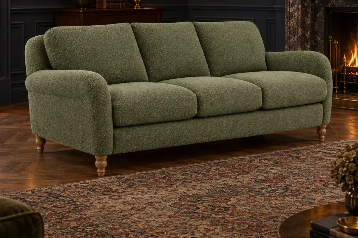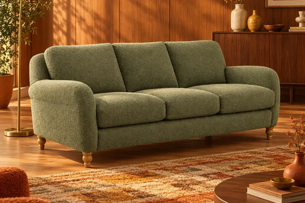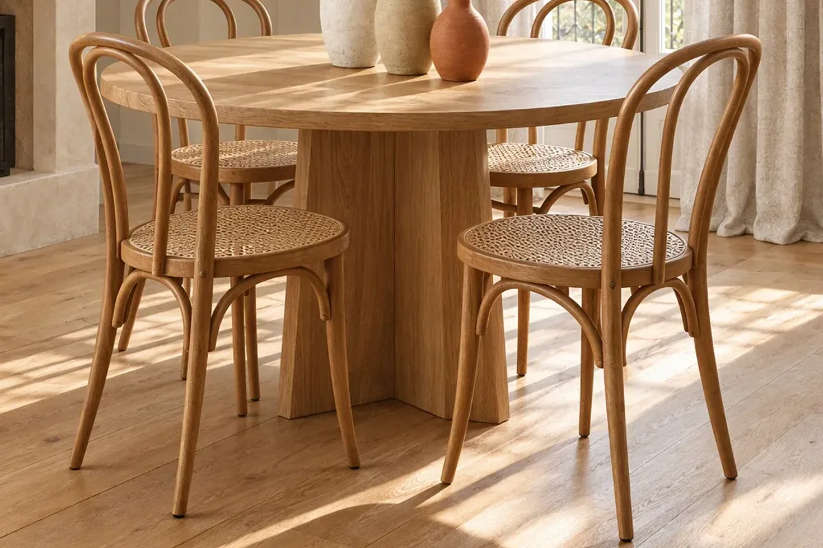
The most reliable way to reduce furniture returns is to remove the guesswork before checkout. Show the product in real rooms, state the dimensions where nobody can miss them, describe materials honestly and let shoppers see the piece in their own space. A return usually means the customer imagined one thing and received another.
Why are furniture returns so expensive?
Returns are a large cost across retail. The National Retail Federation and Happy Returns expected about 15.8% of US retail sales to come back in 2025, and 19.3% of online sales.
Furniture makes each of those returns hurt more. A sofa cannot go back in a padded envelope. It needs a collection slot, two people and a van, and it often comes back marked or impossible to resell at full price. One returned order can wipe out the margin on several good ones, which is why prevention is worth more here than in almost any other category.
What actually causes them?
Leaving aside delivery damage, most returns fall into three groups:
- It does not fit. The piece is larger or smaller than the shopper pictured, or it will not go through the door.
- It does not look like the photo. The colour reads differently in their light, or the fabric looks flatter than the studio shot suggested.
- It does not suit the room. Nothing is wrong with the product. It just looks out of place next to what they already own.
All three happen in the shopper’s head before they click buy. That is good news, because it means your product page can fix them.
Which changes make the biggest difference?
| Cause of return | What to change on the page |
|---|---|
| Wrong size | Dimensions in the first screen, a scale image with a person or a familiar object, and packaged size for access |
| Colour or texture surprise | Close-up detail shots, daylight and evening images, and swatches on request |
| Does not suit the room | The product staged in several room styles, and a way to preview it in the shopper’s own room |
| Unclear expectations | Plain delivery and assembly details before the basket |
How do room images help?
A white-background photo is useful for comparing products, but it gives no sense of scale or mood. A room image does. When a shopper sees your armchair beside a window, a rug and a side table, they understand its size without reading a number.
One room is a start. Several are better, because your customers do not all live in the same kind of home. With Reimagine you can stage one plain photo of a product in a Scandi room, a warm modern room and a darker, moodier room, without booking a shoot for each.
What does a room preview add?
It closes the last gap. Your styled room is still your room. When the shopper uploads a photo of their own living room and places your sofa in it, they are judging the real decision. Products listed on the Splatr marketplace can be tried this way, at realistic scale and in the room’s own light.
Shopify has reported that merchants who add 3D content to their stores see a 94% conversion lift on average. That figure is about conversion, and it comes from Shopify’s own data, but the reasoning carries over: people who can picture the product are more sure of what they are buying.
Be honest about the limits too. A preview is a visualisation, so ask shoppers to check dimensions and finishes on the product page before ordering. Setting that expectation is part of preventing the return.
What should you measure?
Track return reasons, not only the return rate. Ask one short question on the returns form: was it size, colour, quality, damage or a change of mind? After you improve a product’s images, compare that product’s return reasons over the next few months against the months before. If “not as expected” falls, you have found what works and can roll it out across the catalogue.
For the page itself, see what a furniture product page needs.
Put the guide into practice.
Stage your own products and make your first reel in Splatr.
7-day free trial.